
This is a general example of a 3D scatter plot!!!!!
 Data visualization is the term applied to very numerical and computer driven animations of complex processes. Using these kinds of computer visualizations one can "see" behaviors and phonomena not readily visible in the real world (class notes).


 A stem and leaf plot is a display that shows the shape and distribution of a set of data (google).


 The above graph is an example of a bilateral graph. A bilateral graph "is a graph of two related variables" (class notes visualization). The graph above shows growth in bilateral humanitarian assistance from 2005-2006.
  The above map is a good example of a basic line graph. A line graph is "a graph that uses line segments to show changes in data; the data usually represents a quantity changing over time" (google define). The above line graph shows Dow Jones Industrial Averages from 1985 to 2005. I love line graphs because they are so easy and simple to read.
 The above map is an example of a range graded proportional circle map. The information represented by the circles in this map is taken from the population in relation to urbanized areas.
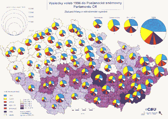
 This is a map, not necessarily on the map catalog list, but one we learned about the first chapter into our class. We questioned whether movies could be considered maps and I believe that movies absolutely can be considered a map in one sense or another. I got the idea to look for a Chronicles of Narnia map because I watched a "family movie" last night and we watched the new Narnia movie Prince Caspian. There so much geography and such to this story that Narnia would be a great example of a movie map. Not only are there journeys "trackable" (mapwise), but story lines also in some sense to me can be considered map-like.


 An isopleth is any line on a weather map connecting points with equal values of a particular atmospheric variable; temperature, dew point, etc (google definitions). The example of an isopleth map above shows the date found while researching the chloride ion wet deposition in 2003. This map seems to be a variation of an isopleth map because there is no visible line connecting points with equal values, the numerals are just listed next to their dots.


 Isotachs are defined as a line in a given surface connecting points with equal wind speed. The isotach shown above is an example of upper level dynamics and Mesolow development.

 Doppler radar is a system for measuring speed that is based on the doppler effect. The doppler effect according to google definition is "The observed change in the frequency of sound or electromagnetic waves due to the relative motion of the source and observer." This Doppler radar photo was taken of Hurricane Katrina in the midst of the massive crisis that took place a few years ago =(
 The photo pictured above is an example of a black and white aerial photo. Black and white aerial photos are used to distinguish more detail in a picture. This black and white aerial photo is a photo taken of a former train yard also known as the balloon track site.
 This example of cartographic animation depicts data found after Mt. Saint Helens erupted in 1979. Cartographic animation is used fairly regularly and is a great tool because it helps people better visualize and take in the data they are being shown.
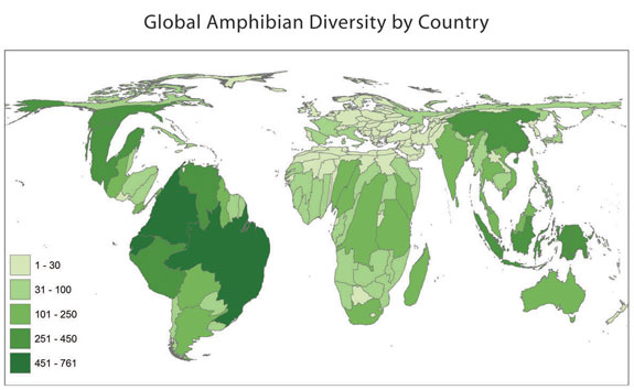 This map is an example of a cartogram!! A cartogram (while they can vary) is typically defined as a map giving statistical data by means of lines, dots, shaded areas, etc (websters dictionary). The map above is a cartogram that depicts the diversity of the worlds amphibians.


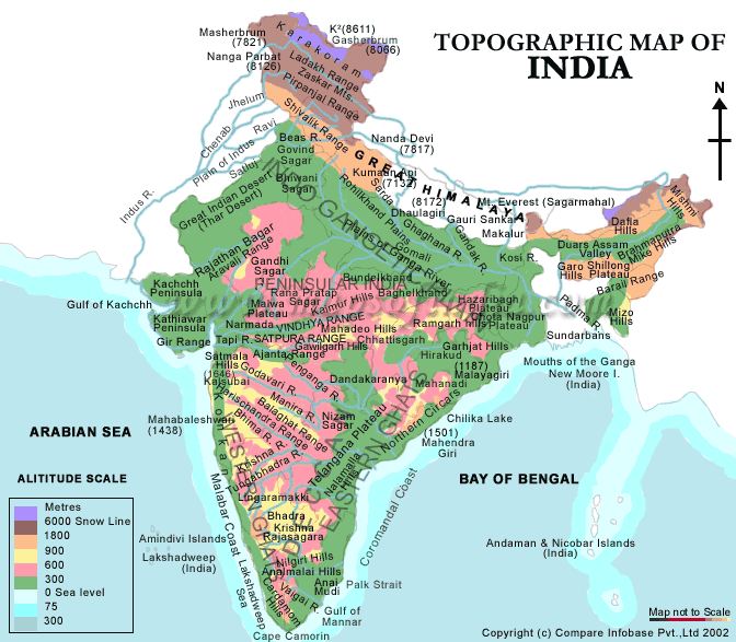 This is an example of a topographic map. A topographic map "is a map that accurately depicts the physical features and relief of an area" (google define). This map shows the physical features and relief of India.
 This is a map of hotspots located across south america. I actually found this website with the help of mr. sulik because I had problems using google earth. This KML was created by Fire Information for Resource Management Systems with the help of NASA to pinpoint and deliver "global hotspot/fire locations" to natural resource managers".