A Million Maps =)
Saturday, December 6, 2008
Index Value Plot
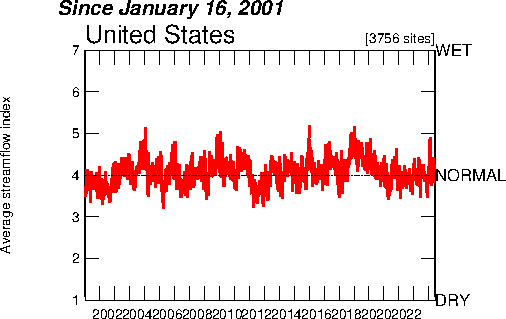
The above map is an example of an index value plot map. It displays the average streamflow in the US since 2001.
http://water.usgs.gov/waterwatch/regplots/pa07d/pa07d_us_2.gif
No comments:
Post a Comment
Newer Post
Older Post
Home
Subscribe to:
Post Comments (Atom)
Blog Archive
▼
2008
(51)
▼
December
(41)
three-dimensional scatter plot
Data Visualization
Concept Mapping
Similarity Matrix
Histogram
Stem and Leaf Plot
Star Plots
Parallel Coordinate Plot
Triangular Plot
Windrose
Climograph
Population Profile
Scatter Plot
Index Value Plot
Accumulated Line Graph
Bilateral Graph
Line Graph
A pie chart is a circular chart divided into diffe...
Range Graded Proportional Circle Maps
Continuously Variable Proportional Circle Map
"Movie Map"
DOQQ
DEM
DLG
DRG
Isopleths
Isopachs
Isohyets
Isotachs
Isobars
LIDAR
Doppler Radar
Black and White Aerial Photo
Infrared Aerial Photo
Cartographic Animations
Statistical Maps
Cartogram
Flow Map
Isoline Maps
Proportional Circle Map
Choropleth Maps
►
November
(8)
►
October
(1)
►
September
(1)
About Me
Just call me Caitlin Columbus =)
View my complete profile
No comments:
Post a Comment