Sunday, December 7, 2008

three-dimensional scatter plot


This is a general example of a 3D scatter plot!!!!!

Data Visualization

Data visualization is the term applied to very numerical and computer driven animations of complex processes. Using these kinds of computer visualizations one can "see" behaviors and phonomena not readily visible in the real world (class notes).

Concept Mapping


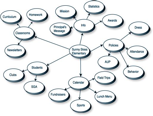
The example shown in this post is an example of concept mapping. Concept mapping seeks to organize words and ideas into clusters, so we can see a better structure of information.

Similarity Matrix


A similarity matrix is a matrix of scores which express the similarity between two data points (wikipedia).

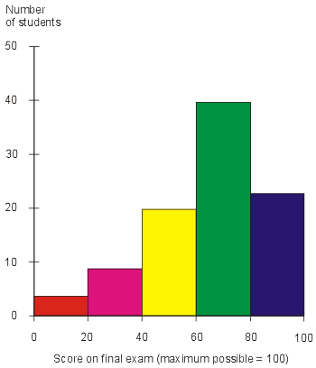
Histogram


A histogram displays tabulated frequencies. The example I have chosen is a histogram showing students score on their final exam.

Saturday, December 6, 2008

Stem and Leaf Plot

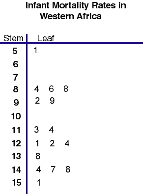
A stem and leaf plot is a display that shows the shape and distribution of a set of data (google).
The above stem and leaf plot shows the infant fatility rates in Western Africa in relation to the number of infant deaths per 1,000 live births.

Star Plots


A star plot allows you to compare multiple variables for each observation (class notes). The above example is a star plot of automobile data. "Each star represents one car model; each ray in the star is proportional to one variable. Only the 8 lightest (top two rows) and 8 heaviest models (bottom two rows) are shown" (http://images.google.com/imgres?imgurl=http://www.math.yorku.ca/SCS/icons/sugi16/staraut2.gif&imgrefurl=http://www.math.yorku.ca/SCS/sugi/sugi16-paper.html&usg=__mDiECDfJ53YhVcmDhPAe7586ZXU=&h=370&w=376&sz=9&hl=en&start=1&um=1&tbnid=yMXF5V0g0wSCBM:&tbnh=120&tbnw=122&prev=/images%3Fq%3Dstar%2Bplot%26um%3D1%26hl%3Den%26rlz%3D1T4GPEA_enUS297US302%26sa%3DN).


Parallel Coordinate Plot

"In the parallel coordinate plot, each variable is graphed on a vertical axis. A date element is plotted as a connected set of points, one on each axis" (class notes visualization). The above example of a parallel coordinate plot is of some standardized data.

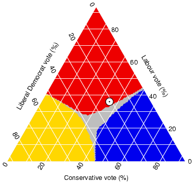
Triangular Plot


A triangle plot displays information from three different variables in a triangular shape. The above triangle plot displays information concerning voting during an election

Windrose


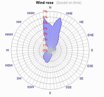
A windrose is a circular diagram showing, for a specific location, the percentage of the time the wind is from each compass direction (google define). The wind rose I have chosen as my example is based on time.
tp://www.cres.gr/windrose/joomla/images/windrose_time.png

Climograph


A climograph is a bar or line graph used to depict average monthly temperatures and precipitation (google define). The climograph pictured in this post is of the Taiga Region.

Population Profile


A population profile (or population pyramid) is in simplest terms, a chart showing the number of people as a function of their ages (google define). The above chart shows the information gathered after the 2001 census in coventry.
http://www.coventry.gov.uk/ccm/cms-service/stream/image/?image_id=1660022

Scatter Plot


The above scatter plot shows the score difference between the SAT and the BETA test.

Index Value Plot


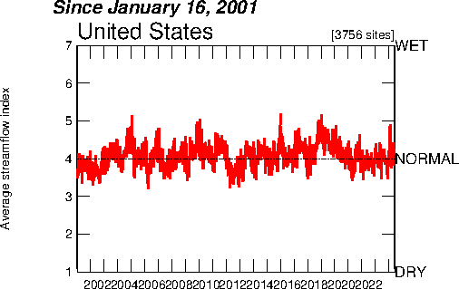
The above map is an example of an index value plot map. It displays the average streamflow in the US since 2001.

http://water.usgs.gov/waterwatch/regplots/pa07d/pa07d_us_2.gif

Accumulated Line Graph


"Accumulative line graphs show how a metric adds up to a total over a period of time (ie- how P/L adds up to Total P/L over a period of time). Accumulative line graphs are useful in showing the cumulation and acceleration (or deceleration) of growth. " The above accumulative line graph shows the accumulation of total profit/loss (y-axis) per day (x-axis).

Bilateral Graph

The above graph is an example of a bilateral graph. A bilateral graph "is a graph of two related variables" (class notes visualization). The graph above shows growth in bilateral humanitarian assistance from 2005-2006.

Line Graph

The above map is a good example of a basic line graph. A line graph is "a graph that uses line segments to show changes in data; the data usually represents a quantity changing over time" (google define). The above line graph shows Dow Jones Industrial Averages from 1985 to 2005. I love line graphs because they are so easy and simple to read.

http://images.freshmeat.net/editorials/r_intro/images/line-graph-1.jpg

A pie chart is a circular chart divided into different sections based on information given relating to the subject being studied or researched. For example, a pie chart relating to your time spent during the day might divided into three basic sections: eating, sleeping, and working. Each section's size and color would depend on how much time of of the day (based on a 24-hour time period) was spent on each. I chose the above pie chart because it is unusually shaped but still circular, and I don't like how close the colors chosen for airplanes and buses are.
http://www.nevron.com/gallery/FullGalleries/chart/pie/images/01-standard-pie-chart-02.png

Range Graded Proportional Circle Maps

The above map is an example of a range graded proportional circle map. The information represented by the circles in this map is taken from the population in relation to urbanized areas.
Continuously Variable Proportional Circle Map


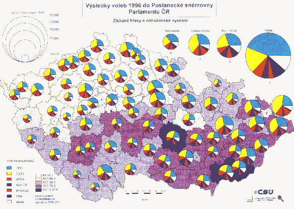
The map above is an example of a continuously variable proportional circle map. It actually is a combination of a chloropleth map as well. While the key is quite small in this picture (and in a different language lol), from looking at this picture, you can tell that the size of each circle relates to a different area in the Czech Republic and each circle is a different size. Their size corresponds with how much that area of Czech Republic consists of in relation to the key.