Wednesday, December 3, 2008

Statistical Maps


A statistical map is basically a map that depicts the information taken from statistics. However, put in map form, the statistics are better relayed, as you can see in the map above. This is a statistical map depicting the crime statistics in a certain area.

Cartogram

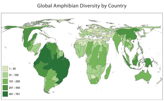
This map is an example of a cartogram!! A cartogram (while they can vary) is typically defined as a map giving statistical data by means of lines, dots, shaded areas, etc (websters dictionary). The map above is a cartogram that depicts the diversity of the worlds amphibians.

Tuesday, December 2, 2008

Flow Map


A flow map is a map that aims to show the movement of objects from one location to another. For example the number of people in a migration, the amount of goods being traded, or the number of packets in a network. This map is an example of a traffic flow map, it counts traffic volume on city streets and maintains those records.

Isoline Maps


An isoline map is "a map with continuous lines joining points of the same value such as equal altitude (contour lines) or temperature (isotherms)(http://sio.midco.net/dansmapstamps/isoline.htm)." This particular isoline map shows point measurements and surface core locations! http://gis.esri.com/library/userconf/proc02/pap0167/p01674.jpg

Proportional Circle Map


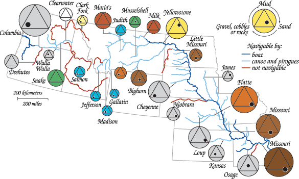
A proportional circle map is a map in which the information being displayed is done in relation to the size of circles on the map. The information displayed in this proportional circle map is also done in relation to the colors of the circles.

Choropleth Maps


A choropleth map "is based on predefined areal units, such as states, counties, census tracts, etc" (http://www.ilstu.edu/~jrcarter/Geo204/Choro/). This choropleth map shows amount of money spent by overseas residents in 2003.

Thursday, November 27, 2008

Dot Distribution map


This map is an example of a dot distribution map. It is a map of Ohio that shows how many military families are scattered across the state, some living many hours away from the closest base. I picked this map because I have some very close friends in the military and they are scattered all over the US and this map of Ohio kind of gives you a little picture of how far apart some families are placed (or distributed) from others. http://operationmilitarykids.ohio4h.org/resources/images/dotMap.gif